Visual Design Design visuel Projektowanie graficzne Diseño visual

Case study · Brand refreshÉtude de cas · Refonte de marqueCase study · Odświeżenie markiCaso de estudio · Renovación de marca

Same flower, a clearer name.La même fleur, un nom plus lisible.Ten sam kwiat, czytelniejsza nazwa.La misma flor, un nombre más claro.

A light refresh for 4th Street Studios, an art café, shop and greenhouse in Laramie: the founder's hand-drawn flower kept, and the brand made clearer, more accessible and easy for a small team to use.Une refonte légère pour 4th Street Studios, café d’art, boutique et serre à Laramie : la fleur dessinée à la main par la fondatrice est conservée, et la marque devient plus claire, plus accessible et facile à utiliser pour une petite équipe.Delikatne odświeżenie marki 4th Street Studios, artystycznej kawiarni, sklepu i szklarni w Laramie: odręcznie narysowany kwiat założycielki został, a marka stała się czytelniejsza, bardziej dostępna i łatwa w użyciu dla małego zespołu.Una renovación ligera para 4th Street Studios, café de arte, tienda e invernadero en Laramie: se conserva la flor dibujada a mano por la fundadora y la marca gana claridad, accesibilidad y facilidad de uso para un equipo pequeño.

The refreshed 4th Street Studios logo: an orange seven-petal flower with a red center beside the name in a thin, elegant serif
ClientClientKlientCliente
4th Street Studios, home of Science Loves Art, Laramie, Wyoming4th Street Studios, qui accueille Science Loves Art, Laramie, Wyoming4th Street Studios, siedziba Science Loves Art, Laramie, Wyoming4th Street Studios, sede de Science Loves Art, Laramie, Wyoming
My roleMon rôleMoja rolaMi rol
Brand designer: audit, logo cleanup, visual system, guidelines, templatesDesigner de marque : audit, nettoyage du logo, système visuel, charte, modèlesProjektantka marki: audyt, dopracowanie logo, system wizualny, wytyczne, szablonyDiseñadora de marca: auditoría, limpieza del logo, sistema visual, manual, plantillas
ScopePérimètreZakresAlcance
Light refresh, not a rebrandRefonte légère, pas un rebrandingDelikatne odświeżenie, nie rebrandingRenovación ligera, no un rebranding
YearAnnéeRokAño
2026
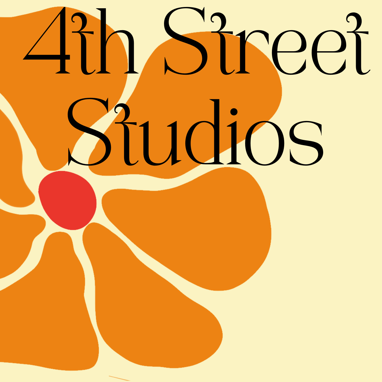
The original logo: a thin serif name set over a cropped orange flower on butter yellow

01 · The challenge01 · L’enjeu01 · Wyzwanie01 · El reto

A charming brand, ready for everyday use.Une marque pleine de charme, prête pour le quotidien.Urocza marka, gotowa do codziennego użytku.Una marca encantadora, lista para el día a día.

  • The name needed room. A thin, high-contrast serif sat on top of the petals, so the letters and petals overlapped at profile-picture and sign sizes.Le nom avait besoin d’espace. Une serif fine et très contrastée était posée sur les pétales, si bien que lettres et pétales se chevauchaient en photo de profil comme sur une enseigne.Nazwa potrzebowała miejsca. Cienki, mocno kontrastowy krój szeryfowy leżał na płatkach, więc w rozmiarze zdjęcia profilowego i szyldu litery nachodziły na płatki.El nombre necesitaba espacio. Una serifa fina y de alto contraste se apoyaba sobre los pétalos, así que letras y pétalos se superponían en tamaño de foto de perfil y de rótulo.
  • The flower lived in a crop. It bled off the edge of a square, so it wasn't yet available as a standalone mark, stamp or icon.La fleur était recadrée. Elle débordait d’un carré, et n’existait donc pas encore comme symbole, tampon ou icône à part entière.Kwiat był przycięty. Wychodził poza krawędź kwadratu, więc nie istniał jeszcze jako samodzielny znak, pieczątka czy ikona.La flor vivía recortada. Se salía del borde de un cuadrado, así que aún no existía como símbolo, sello o icono independiente.
  • The colors could work together more. A butter-yellow background softened the orange, and the red center sat close to the orange in brightness.Les couleurs pouvaient mieux s’accorder. Un fond jaune beurre atténuait l’orange, et le cœur rouge avait une luminosité proche de celle de l’orange.Kolory mogły lepiej ze sobą współgrać. Maślanożółte tło przygaszało pomarańcz, a czerwony środek miał podobną jasność jak pomarańcz.Los colores podían funcionar mejor juntos. Un fondo amarillo mantequilla apagaba el naranja, y el centro rojo tenía una luminosidad parecida a la del naranja.
  • Type could be more consistent. Several typefaces were in use, and a playful body font with bouncing letters can be harder to read in longer text, especially for people with low vision or dyslexia.La typographie pouvait être plus cohérente. Plusieurs polices coexistaient, et une police de texte ludique aux lettres sautillantes peut être plus difficile à lire sur de longs textes, en particulier pour les personnes malvoyantes ou dyslexiques.Typografia mogła być spójniejsza. Używano kilku krojów, a zabawny krój tekstowy ze skaczącymi literami bywa trudniejszy w czytaniu przy dłuższych tekstach, zwłaszcza dla osób słabowidzących lub z dysleksją.La tipografía podía ser más coherente. Se usaban varias fuentes, y una fuente de texto juguetona con letras saltarinas cuesta más de leer en textos largos, sobre todo para personas con baja visión o dislexia.

The refresh was also a chance to show how 4th Street and Science Loves Art, which runs workshops in its greenhouse, are connected.La refonte était aussi l’occasion de montrer le lien entre 4th Street et Science Loves Art, qui anime des ateliers dans sa serre.Odświeżenie było też okazją, by pokazać związek między 4th Street a Science Loves Art, które prowadzi warsztaty w jej szklarni.La renovación también fue una oportunidad para mostrar la conexión entre 4th Street y Science Loves Art, que organiza talleres en su invernadero.

Before and afterAvant / aprèsPrzed i poAntes y después

Her flower, completed. Her name, given room.Sa fleur, complétée. Son nom, mis en valeur.Jej kwiat, uzupełniony. Jej nazwa, z miejscem do oddychania.Su flor, completada. Su nombre, con espacio.

Before: the name set over a cropped flower
Before. The name sat on the petals of a cropped flower.Avant. Le nom était posé sur les pétales d’une fleur recadrée.Przed. Nazwa leżała na płatkach przyciętego kwiatu.Antes. El nombre se apoyaba en los pétalos de una flor recortada.
After: the completed flower beside a clear name
After. The completed flower beside the name, on warm cream.Après. La fleur complète à côté du nom, sur un crème chaleureux.Po. Pełny kwiat obok nazwy, na ciepłym kremie.Después. La flor completa junto al nombre, sobre un crema cálido.

02 · Approach02 · Approche02 · Podejście02 · Enfoque

Organize and clean up, don't replace.Organiser et nettoyer, pas remplacer.Uporządkować i dopracować, nie zastępować.Ordenar y limpiar, no reemplazar.

The client was clear about that, so I treated it as the design constraint and focused my recommendations on one thing: accessibility.La cliente était claire sur ce point : j’en ai fait la contrainte de design et j’ai concentré mes recommandations sur une seule chose, l’accessibilité.Klientka postawiła sprawę jasno, więc potraktowałam to jako ograniczenie projektowe i skupiłam rekomendacje na jednym: dostępności.La clienta lo dejó claro, así que lo tomé como la restricción de diseño y centré mis recomendaciones en una sola cosa: la accesibilidad.

01

Keep what people loveGarder ce que les gens aimentZachować to, co ludzie kochająConservar lo que la gente quiere

The flower and the warm orange-and-red palette stayed. They're the most recognizable parts of the brand.La fleur et la palette chaleureuse d’orange et de rouge sont restées. Ce sont les éléments les plus reconnaissables de la marque.Kwiat i ciepła, pomarańczowo-czerwona paleta zostały. To najbardziej rozpoznawalne elementy marki.La flor y la cálida paleta naranja y roja se quedaron. Son lo más reconocible de la marca.

02

Recommend, with reasonsRecommander, en expliquant pourquoiRekomendować i uzasadniaćRecomendar, con argumentos

I made the case for separating the name from the flower, framed around readability, and offered side-by-side mockups so she could see the difference.J’ai plaidé pour séparer le nom de la fleur, sous l’angle de la lisibilité, et proposé des maquettes côte à côte pour qu’elle voie la différence.Przekonywałam do oddzielenia nazwy od kwiatu, argumentując czytelnością, i pokazałam makiety obok siebie, żeby mogła zobaczyć różnicę.Defendí separar el nombre de la flor, con el argumento de la legibilidad, y ofrecí maquetas lado a lado para que ella viera la diferencia.

03

Connect the two brands quietlyRelier discrètement les deux marquesDyskretnie połączyć obie markiConectar las dos marcas con discreción

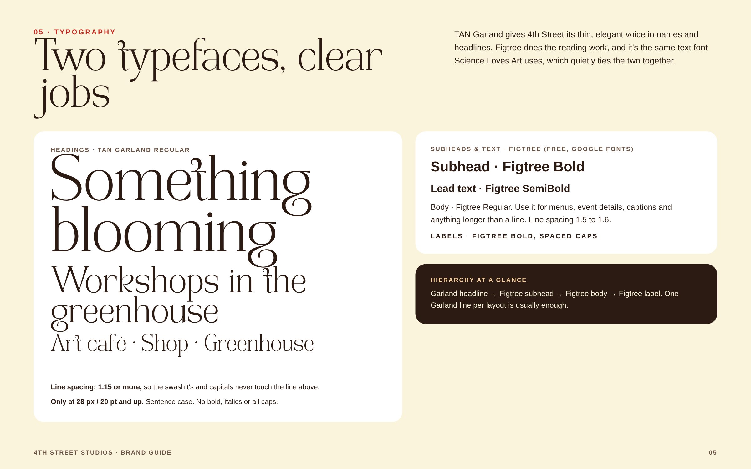
4th Street and Science Loves Art share one invisible element: the same text font, Figtree, so every poster feels like it comes from the same home.4th Street et Science Loves Art partagent un élément invisible : la même police de texte, Figtree, pour que chaque affiche semble venir de la même maison.4th Street i Science Loves Art łączy jeden niewidoczny element: ten sam krój tekstowy, Figtree, dzięki czemu każdy plakat wygląda, jakby pochodził z tego samego domu.4th Street y Science Loves Art comparten un elemento invisible: la misma fuente de texto, Figtree, para que cada cartel parezca salir de la misma casa.

04

Let her feedback set the voiceLaisser ses retours donner le tonPozwolić, by jej uwagi nadały tonDejar que sus comentarios marquen el tono

She wanted 4th Street thin and clean, leaving bold, rounded 70s headings to Science Loves Art. Each brand got a clear personality.Elle voulait un 4th Street fin et épuré, en laissant les titres gras et arrondis des années 70 à Science Loves Art. Chaque marque a gagné une personnalité claire.Chciała, by 4th Street było cienkie i czyste, a mocne, zaokrąglone nagłówki z lat 70. zostawiła Science Loves Art. Każda marka zyskała wyraźną osobowość.Quería un 4th Street fino y limpio, y dejar los titulares gruesos y redondeados de los 70 para Science Loves Art. Cada marca ganó una personalidad clara.

The completed seven-petal flower in orange with a red center

03 · Process03 · Processus03 · Proces03 · Proceso

Rebuilding the flower from her own shapes.Reconstruire la fleur à partir de ses propres formes.Odbudowa kwiatu z jej własnych kształtów.Reconstruir la flor con sus propias formas.

My first cleanup redrew the flower as a smoother, more symmetrical bloom. Her response: it felt too new. That reset the brief, and the final mark keeps her original flower, completed.Mon premier nettoyage redessinait la fleur de façon plus lisse et plus symétrique. Sa réaction : elle paraissait trop neuve. Le brief est reparti de là, et le logo final garde sa fleur d’origine, complétée.W pierwszej wersji przerysowałam kwiat na gładszy, bardziej symetryczny. Jej reakcja: wygląda zbyt nowo. To zmieniło brief, a ostateczny znak zachowuje jej oryginalny kwiat, uzupełniony.Mi primera limpieza redibujó la flor más suave y simétrica. Su respuesta: se sentía demasiado nueva. Eso cambió el encargo, y el símbolo final conserva su flor original, completada.

  • Traced, not redrawn. The fully visible petals and the red center come straight from her artwork.Décalquée, pas redessinée. Les pétales entièrement visibles et le cœur rouge viennent directement de son dessin.Odrysowany, nie przerysowany. W pełni widoczne płatki i czerwony środek pochodzą wprost z jej rysunku.Calcada, no redibujada. Los pétalos completamente visibles y el centro rojo salen directamente de su dibujo.
  • Completed from her own petals. Hidden petals were rebuilt from rotated, mirrored and resized copies, so all seven keep the same hand-cut feel.Complétée avec ses propres pétales. Les pétales cachés ont été reconstruits à partir de copies pivotées, inversées et redimensionnées, pour que les sept gardent le même aspect découpé à la main.Uzupełniony jej własnymi płatkami. Ukryte płatki odtworzyłam z obróconych, odbitych i przeskalowanych kopii, więc wszystkie siedem zachowuje ten sam ręcznie wycinany charakter.Completada con sus propios pétalos. Los pétalos ocultos se reconstruyeron con copias rotadas, reflejadas y redimensionadas, para que los siete conserven el mismo aire recortado a mano.
  • Original colors kept. Only the background moved, from butter yellow to a warm cream that lets the orange glow.Couleurs d’origine conservées. Seul le fond a changé, du jaune beurre à un crème chaleureux qui fait rayonner l’orange.Oryginalne kolory zostały. Zmieniło się tylko tło, z maślanożółtego na ciepły krem, na którym pomarańcz świeci.Colores originales conservados. Solo cambió el fondo, del amarillo mantequilla a un crema cálido que hace brillar el naranja.
  • The name gets its own space. Set beside the flower in TAN Garland, her chosen typeface, with line spacing opened so the swash t's never touch.Le nom a son propre espace. Composé à côté de la fleur en TAN Garland, la police qu’elle avait choisie, avec un interligne plus généreux pour que les t ornés ne se touchent jamais.Nazwa dostaje własną przestrzeń. Złożona obok kwiatu krojem TAN Garland, który wybrała, z większą interlinią, żeby ozdobne litery t nigdy się nie stykały.El nombre tiene su propio espacio. Compuesto junto a la flor en TAN Garland, la tipografía que ella eligió, con más interlineado para que las t ornamentadas nunca se toquen.

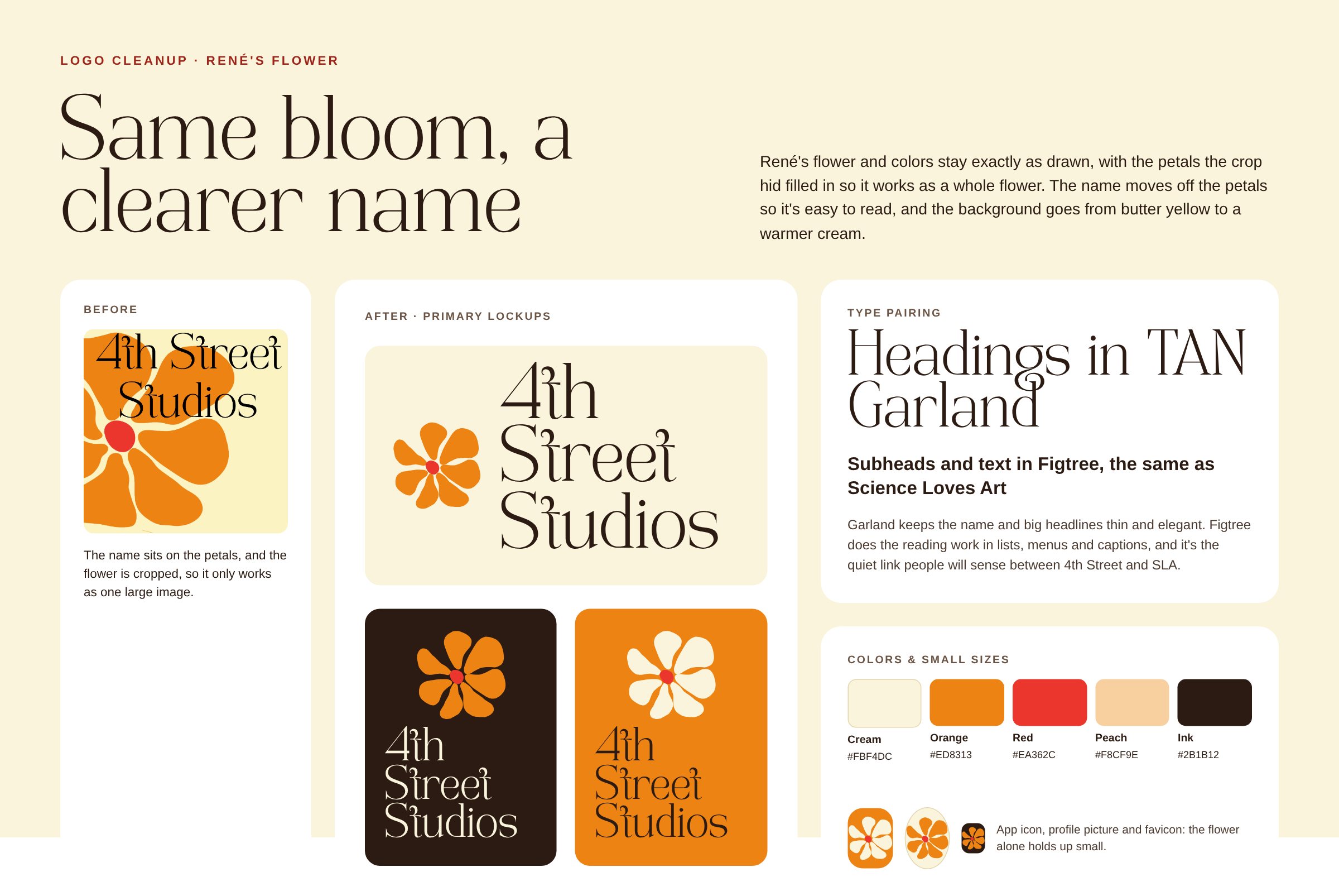
The cleanup at a glanceLe nettoyage en un coup d’œilDopracowanie w skrócieLa limpieza de un vistazo

Same bloom, a clearer name.La même fleur, un nom plus lisible.Ten sam kwiat, czytelniejsza nazwa.La misma flor, un nombre más claro.

Overview board: the original artwork, the new primary lockups on cream, ink and orange, the type pairing and the color palette

04 · The system04 · Le système04 · System04 · El sistema

Small on purpose.Volontairement réduit.Celowo niewielki.Pequeño a propósito.

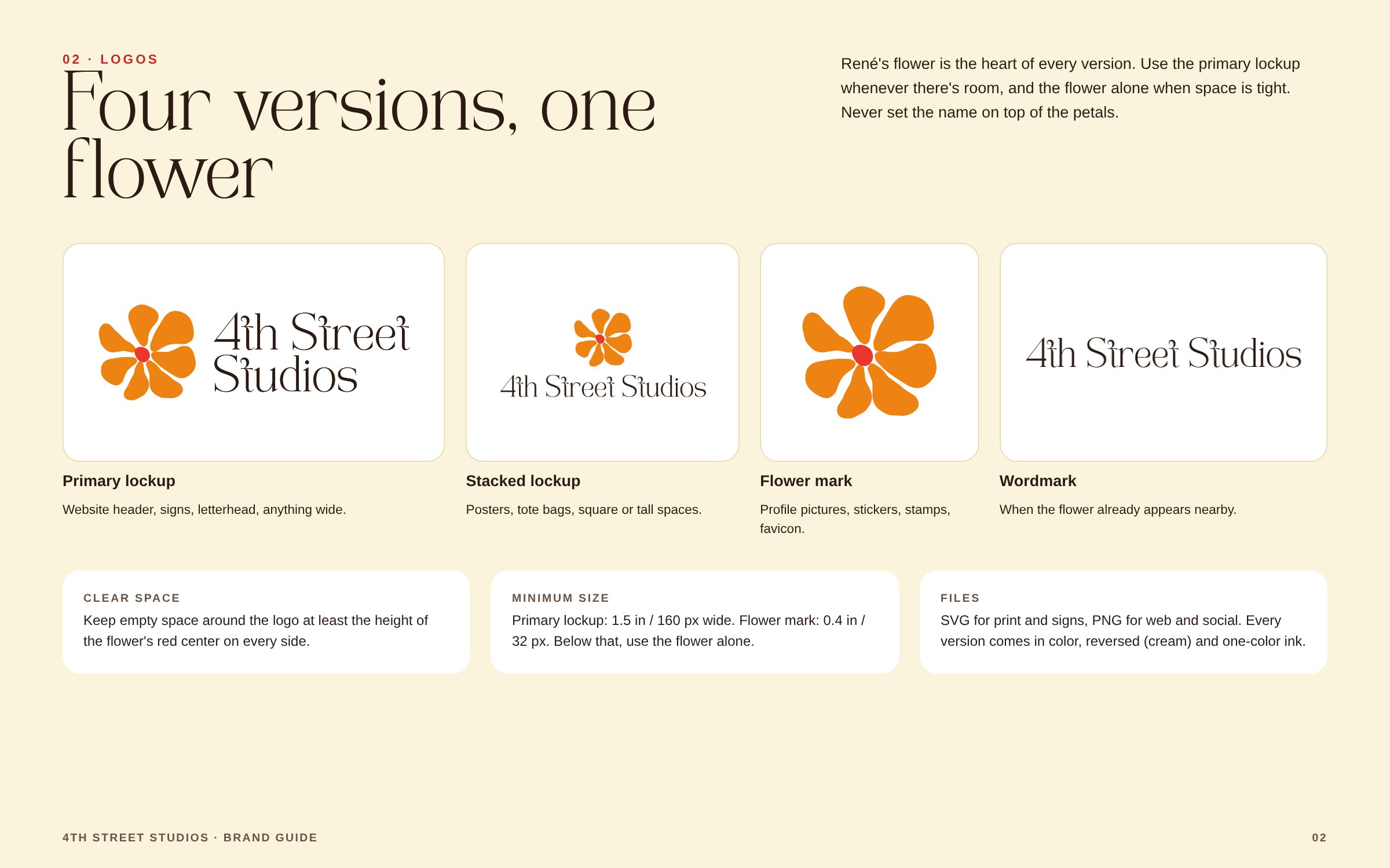
One flower, four logo versions, five colors and two typefaces, each with a clear job. Every logo comes in color, reversed and one-color versions, as SVG and PNG, with the lettering converted to outlines.Une fleur, quatre versions du logo, cinq couleurs et deux polices, chacune avec un rôle précis. Chaque logo existe en couleur, en négatif et en une couleur, au format SVG et PNG, avec le lettrage vectorisé.Jeden kwiat, cztery wersje logo, pięć kolorów i dwa kroje pisma, każdy z jasno określonym zadaniem. Każde logo występuje w wersji kolorowej, w kontrze i jednobarwnej, w formatach SVG i PNG, z napisem zamienionym na krzywe.Una flor, cuatro versiones del logo, cinco colores y dos tipografías, cada uno con una función clara. Cada logo existe en color, en negativo y a una tinta, en SVG y PNG, con el texto convertido en contornos.

Primary lockup version of the logo
Primary lockupVersion principaleWersja głównaVersión principal · Website header, signs, letterheadEn-tête du site, enseignes, papier à en-têteNagłówek strony, szyldy, papier firmowyCabecera web, rótulos, papel membretado
Stacked lockup version of the logo
Stacked lockupVersion empiléeWersja pionowaVersión apilada · Posters, tote bags, square spacesAffiches, tote bags, formats carrésPlakaty, torby, formaty kwadratoweCarteles, bolsas de tela, formatos cuadrados
Flower mark version of the logo
Flower markLa fleur seuleSam kwiatLa flor sola · Profile pictures, stickers, faviconPhotos de profil, stickers, faviconZdjęcia profilowe, naklejki, faviconFotos de perfil, stickers, favicon
Wordmark version of the logo
WordmarkLogotypeLogotypLogotipo · When the flower is already nearbyQuand la fleur est déjà à côtéGdy kwiat jest już obokCuando la flor ya está cerca
Reversed version of the logo
ReversedEn négatifW kontrzeEn negativo · Cream lettering on inkLettrage crème sur encreKremowy napis na atramencieLetras crema sobre tinta
On orange version of the logo
On orangeSur orangeNa pomarańczuSobre naranja · Cream flower, ink letteringFleur crème, lettrage encreKremowy kwiat, napis w kolorze atramentuFlor crema, letras en tinta
One-color flower version of the logo
One-color flowerFleur en une couleurKwiat w jednym kolorzeFlor a una tinta · Stamps and single-ink printingTampons et impression en une seule encrePieczątki i druk jednym koloremSellos e impresión a una tinta
Stacked, reversed version of the logo
Stacked, reversedEmpilée, en négatifPionowa, w kontrzeApilada, en negativo · Dark backgroundsFonds sombresCiemne tłaFondos oscuros

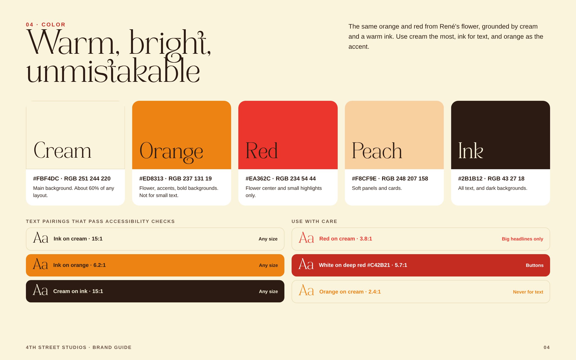
ColorCouleurKolorColor

Her orange and red, grounded by cream and ink.Son orange et son rouge, ancrés par le crème et l’encre.Jej pomarańcz i czerwień, zrównoważone kremem i atramentem.Su naranja y su rojo, equilibrados con crema y tinta.

CreamCrèmeKremCrema#FBF4DCMain background, about 60% of any layoutFond principal, environ 60 % de chaque mise en pageGłówne tło, około 60% każdego układuFondo principal, cerca del 60 % de cada composición
OrangeOrangePomarańczNaranja#ED8313Flower and bold accents, never small textLa fleur et les accents forts, jamais pour du petit texteKwiat i mocne akcenty, nigdy drobny tekstLa flor y los acentos fuertes, nunca texto pequeño
RedRougeCzerwieńRojo#EA362CFlower center and small highlightsLe cœur de la fleur et les petites touchesŚrodek kwiatu i drobne wyróżnieniaEl centro de la flor y pequeños detalles
PeachPêcheBrzoskwiniaMelocotón#F8CF9ESoft panels and cardsPanneaux et cartes douxDelikatne panele i kartyPaneles y tarjetas suaves
InkEncreAtramentTinta#2B1B12All text and dark backgroundsTout le texte et les fonds sombresCały tekst i ciemne tłaTodo el texto y los fondos oscuros
Ink on cream · 15:1 · any sizeEncre sur crème · 15:1 · toutes taillesAtrament na kremie · 15:1 · każdy rozmiarTinta sobre crema · 15:1 · cualquier tamaño
Ink on orange · 6.2:1 · any sizeEncre sur orange · 6,2:1 · toutes taillesAtrament na pomarańczu · 6,2:1 · każdy rozmiarTinta sobre naranja · 6,2:1 · cualquier tamaño
Orange on cream · 2.4:1 · never for textOrange sur crème · 2,4:1 · jamais pour du textePomarańcz na kremie · 2,4:1 · nigdy do tekstuNaranja sobre crema · 2,4:1 · nunca para texto

Accessible by default. Every text-on-background pairing was checked for contrast, and the ones below the accessibility standard are marked in the guide as not for text.Accessible par défaut. Chaque association texte-fond a été vérifiée pour le contraste, et celles qui n’atteignent pas la norme d’accessibilité sont signalées dans la charte comme à ne pas utiliser pour du texte.Dostępność od początku. Każde zestawienie tekstu z tłem sprawdziłam pod kątem kontrastu, a te poniżej standardu dostępności są oznaczone w księdze jako nie do tekstu.Accesible por defecto. Se comprobó el contraste de cada combinación de texto y fondo, y las que no alcanzan el estándar de accesibilidad están marcadas en el manual como no aptas para texto.

05 · Brand guide05 · Charte de marque05 · Księga znaku05 · Manual de marca

Built for a small team in Canva, not for designers.Pensée pour une petite équipe sur Canva, pas pour des designers.Stworzona dla małego zespołu w Canvie, nie dla projektantów.Hecho para un equipo pequeño en Canva, no para diseñadores.
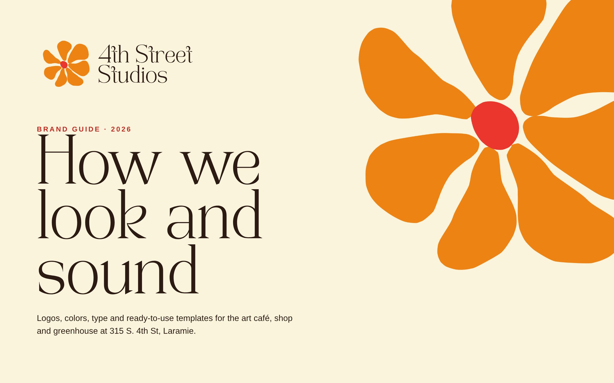
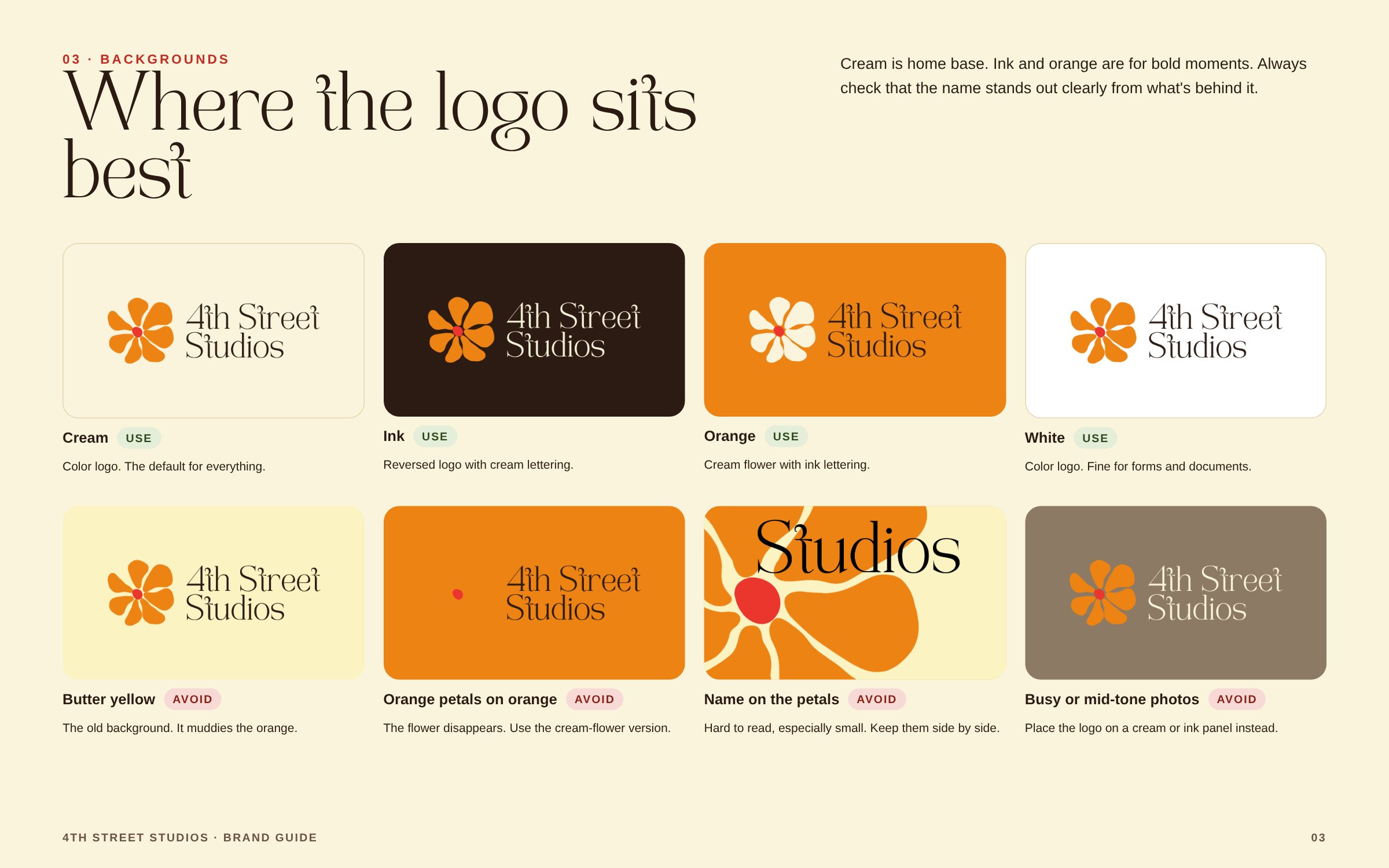
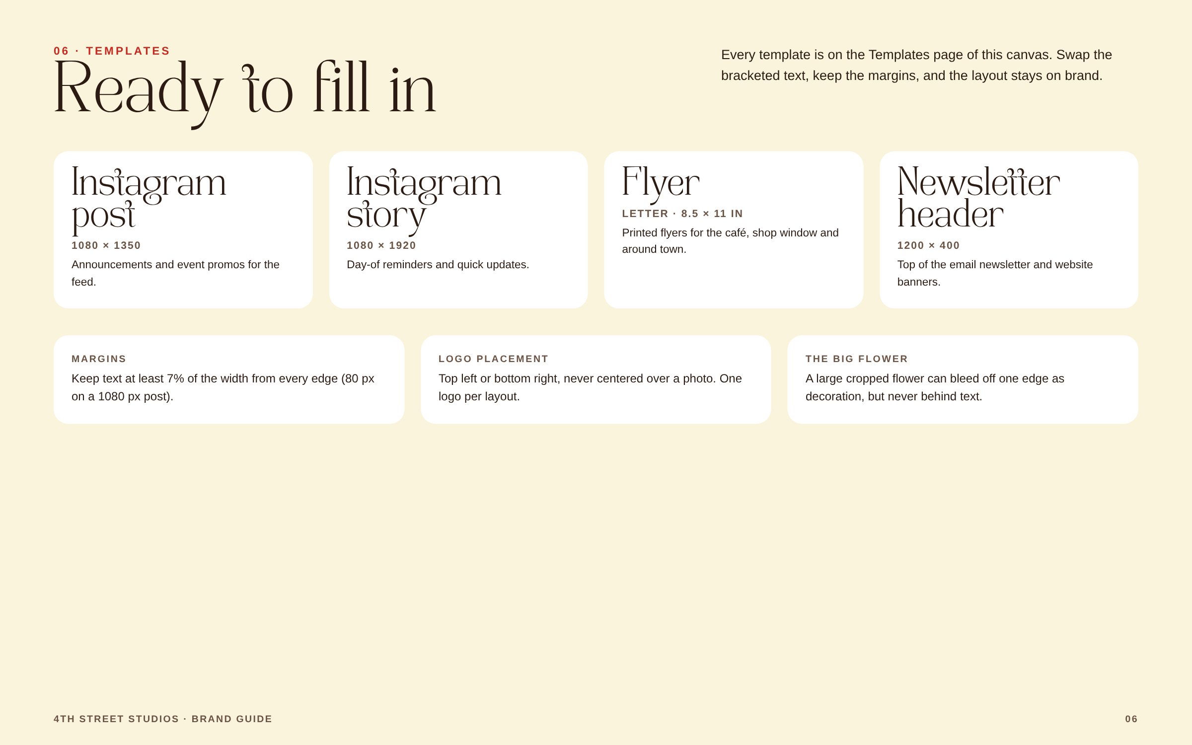
A 13-slide guide covering logos, clear space and minimum sizes, backgrounds to use and avoid, color with contrast ratios, typography rules and layout rules for the templates.Une charte de 13 pages : logos, zones de protection et tailles minimales, fonds à utiliser et à éviter, couleurs avec leurs ratios de contraste, règles typographiques et règles de mise en page pour les modèles.Księga na 13 slajdach: logo, pole ochronne i minimalne rozmiary, tła zalecane i zakazane, kolory ze współczynnikami kontrastu, zasady typografii i zasady składu szablonów.Un manual de 13 diapositivas: logos, área de respeto y tamaños mínimos, fondos recomendados y prohibidos, colores con ratios de contraste, reglas tipográficas y reglas de maquetación para las plantillas.

Brand guide cover: How we look and soundBrand guide: four logo versions, clear space and minimum sizesBrand guide: backgrounds to use and avoidBrand guide: the five colors with contrast-checked text pairingsBrand guide: TAN Garland for headlines, Figtree for readingBrand guide: the four templates and layout rules

06 · Templates06 · Modèles06 · Szablony06 · Plantillas

Four templates, ready to fill in.Quatre modèles, prêts à remplir.Cztery szablony, gotowe do wypełnienia.Cuatro plantillas, listas para completar.
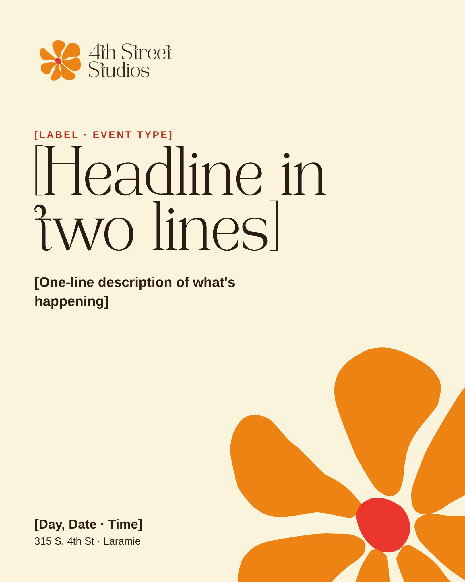
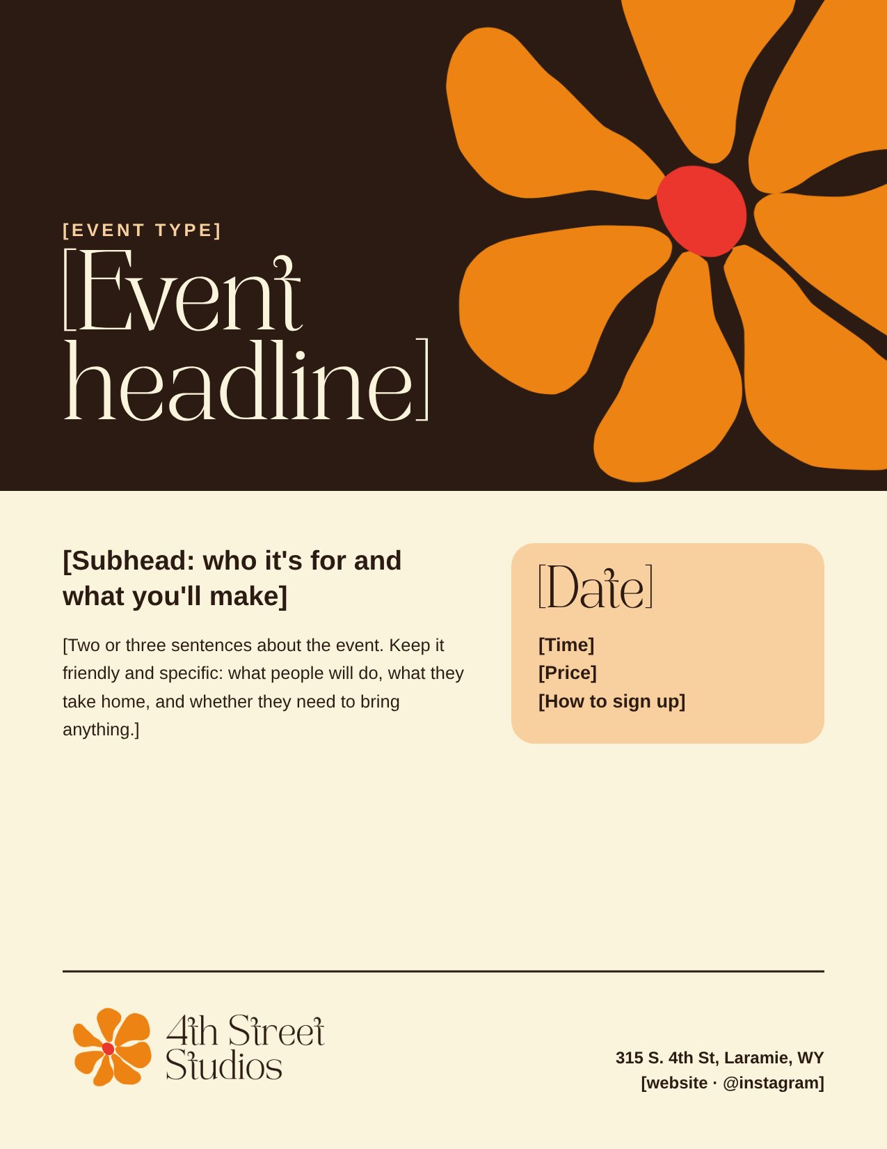
An Instagram post (1080 × 1350), a story (1080 × 1920), a letter-size flyer and a newsletter header (1200 × 400), each its own editable Canva design with bracketed text to swap.Un post Instagram (1080 × 1350), une story (1080 × 1920), un flyer au format lettre et un en-tête de newsletter (1200 × 400), chacun dans un design Canva modifiable, avec du texte entre crochets à remplacer.Post na Instagram (1080 × 1350), relacja (1080 × 1920), ulotka w formacie letter i nagłówek newslettera (1200 × 400), każdy jako osobny edytowalny projekt w Canvie z tekstem w nawiasach do podmiany.Una publicación de Instagram (1080 × 1350), una historia (1080 × 1920), un flyer tamaño carta y una cabecera de newsletter (1200 × 400), cada uno como diseño editable en Canva con texto entre corchetes para cambiar.

Instagram post template
Instagram postPost InstagramPost na InstagramPublicación de Instagram
Instagram story template
Instagram storyStory InstagramRelacja na InstagramHistoria de Instagram
Letter-size flyer template
Flyer · letterFlyer · format lettreUlotka · format letterFlyer · tamaño carta
Newsletter header template
Newsletter headerEn-tête de newsletterNagłówek newsletteraCabecera de newsletter

07 · In use07 · En situation07 · W użyciu07 · En uso

How the system flows.Le système en action.Jak działa system.Cómo fluye el sistema.

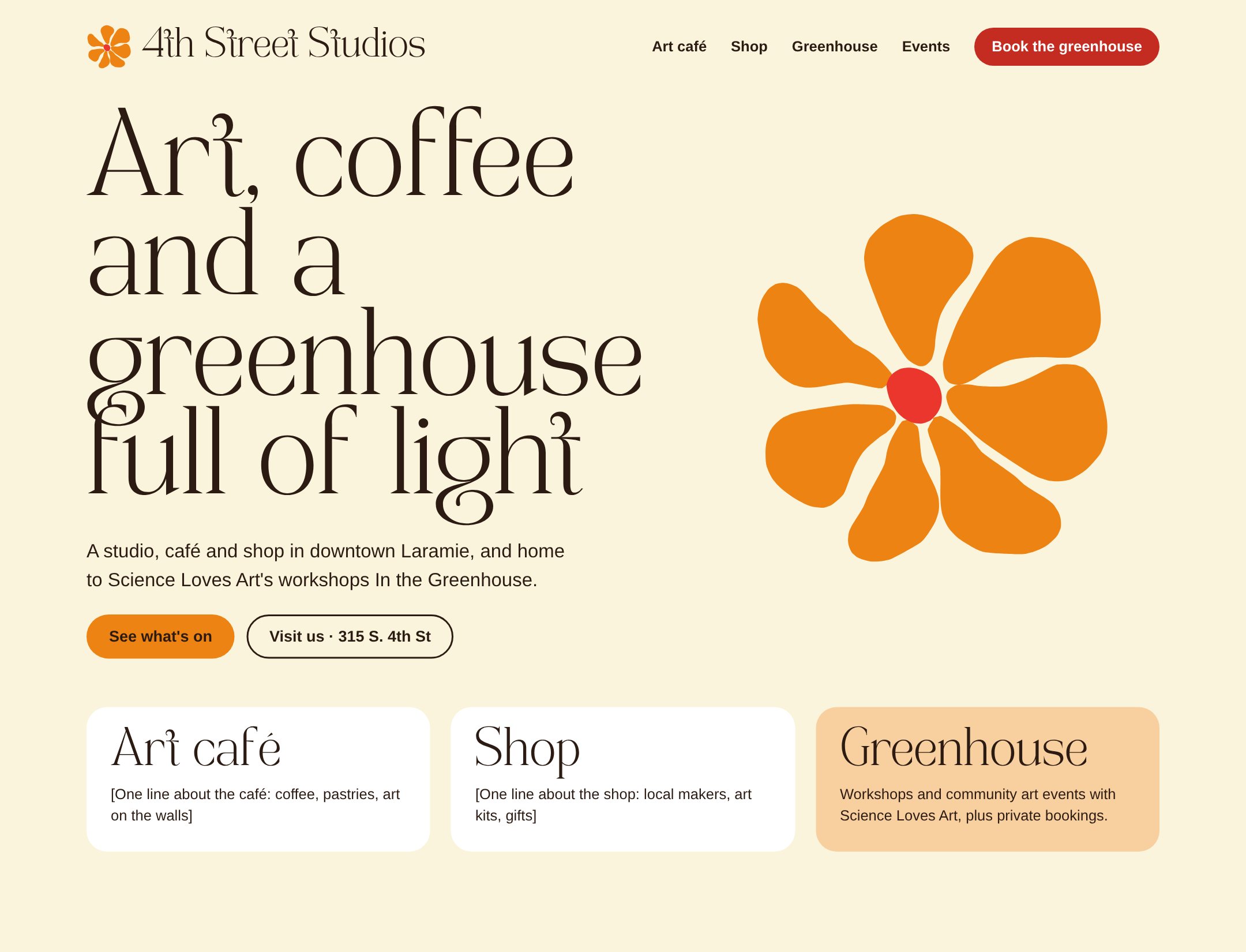
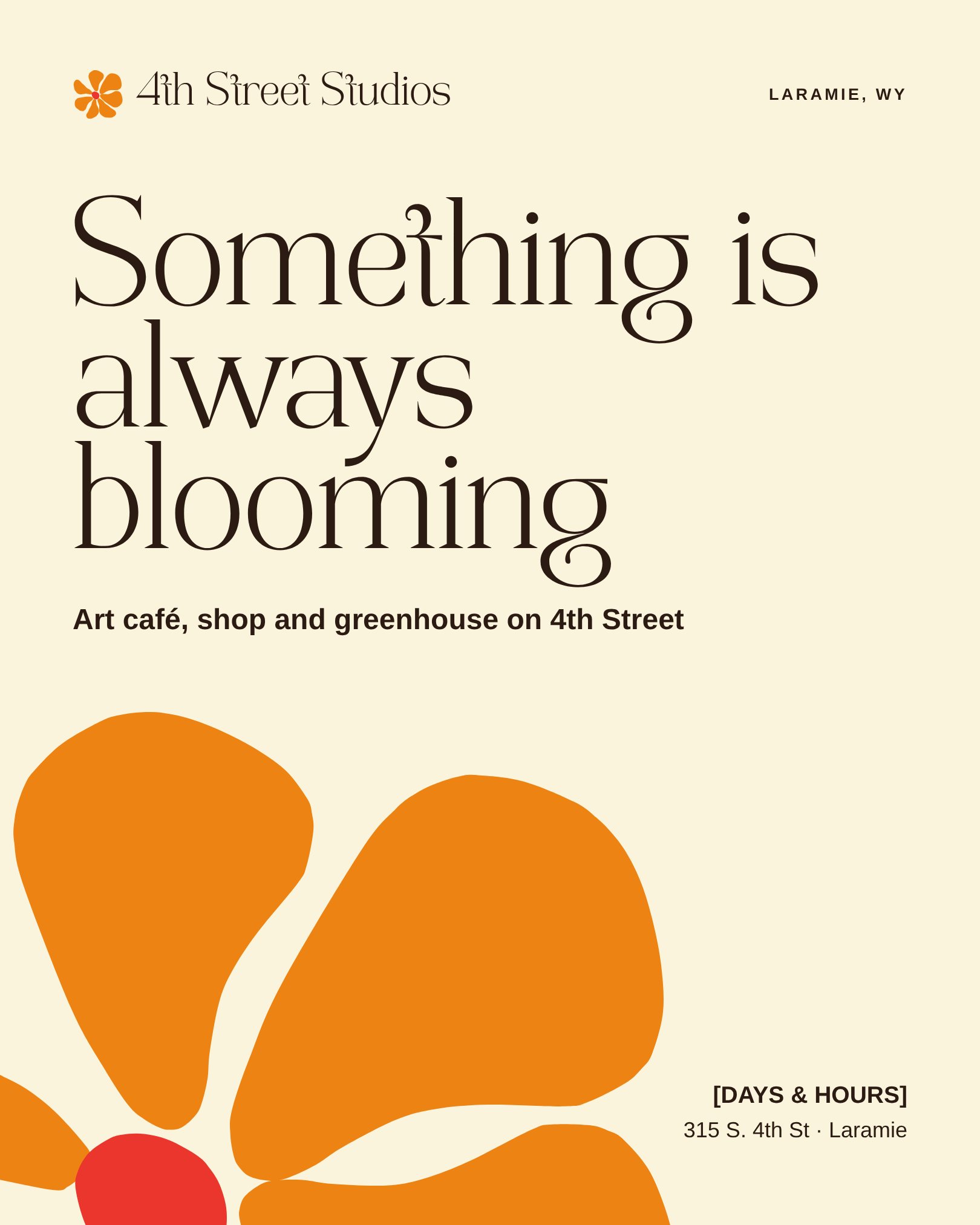
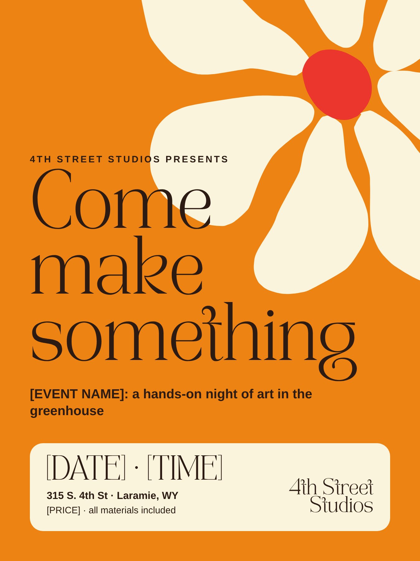
Mockups of an Instagram post, an 18 × 24 event poster and a website header showed the client the whole system before anything was final.Des maquettes d’un post Instagram, d’une affiche d’événement 18 × 24 et d’un en-tête de site ont montré à la cliente l’ensemble du système avant toute validation.Makiety posta na Instagram, plakatu wydarzenia 18 × 24 i nagłówka strony pokazały klientce cały system, zanim cokolwiek zostało zatwierdzone.Maquetas de una publicación de Instagram, un póster de evento de 18 × 24 y una cabecera web mostraron a la clienta todo el sistema antes de cerrar nada.

Website header mockup: Art, coffee and a greenhouse full of light
Instagram post mockup: Something is always bloomingEvent poster mockup: Come make something

08 · Outcome08 · Résultat08 · Efekt08 · Resultado

Still hers, ready for everyday use.Toujours la sienne, prête pour le quotidien.Wciąż jej, gotowa do codziennego użytku.Sigue siendo suya, lista para el día a día.

A brand that still feels like the founder's own, with a clear name, a flower that works at any size, and a toolkit the team can run without a designer.Une marque qui reste celle de la fondatrice, avec un nom lisible, une fleur qui fonctionne à toutes les tailles et une boîte à outils que l’équipe peut utiliser sans designer.Marka, która wciąż jest marką założycielki, z czytelną nazwą, kwiatem, który działa w każdym rozmiarze, i zestawem narzędzi, z którego zespół korzysta bez projektanta.Una marca que sigue sintiéndose de la fundadora, con un nombre claro, una flor que funciona en cualquier tamaño y un kit que el equipo puede usar sin diseñador.

  • Respecting what's loved is part of the craft. My first redraw was smoother, but it lost the hand-made quality she cared about. Rebuilding her flower from her own shapes was the better answer.Respecter ce qu’on aime fait partie du métier. Mon premier dessin était plus lisse, mais il perdait le côté fait main auquel elle tenait. Reconstruire sa fleur à partir de ses propres formes était la meilleure réponse.Szacunek dla tego, co lubiane, to część rzemiosła. Moja pierwsza wersja była gładsza, ale straciła ręcznie robiony charakter, na którym jej zależało. Odbudowa kwiatu z jej własnych kształtów okazała się lepszą odpowiedzią.Respetar lo que se quiere es parte del oficio. Mi primer redibujo era más suave, pero perdía el carácter artesanal que a ella le importaba. Reconstruir su flor con sus propias formas fue la mejor respuesta.
  • Accessibility lands better shown than argued. Side-by-side comparisons kept the conversation collaborative rather than a debate over taste.L’accessibilité se montre mieux qu’elle ne se plaide. Les comparaisons côte à côte ont gardé l’échange collaboratif, plutôt qu’un débat de goûts.Dostępność lepiej pokazać, niż o nią spierać się. Porównania obok siebie sprawiły, że rozmowa była współpracą, a nie sporem o gust.La accesibilidad convence más mostrada que argumentada. Las comparaciones lado a lado mantuvieron la conversación colaborativa en lugar de un debate de gustos.
  • Two brands, one home. A thin, elegant 4th Street and a bold, rounded Science Loves Art, tied together by a shared text font.Deux marques, une même maison. Un 4th Street fin et élégant, un Science Loves Art gras et arrondi, réunis par une police de texte commune.Dwie marki, jeden dom. Cienkie, eleganckie 4th Street i mocne, zaokrąglone Science Loves Art, połączone wspólnym krojem tekstowym.Dos marcas, una casa. Un 4th Street fino y elegante y un Science Loves Art grueso y redondeado, unidos por una fuente de texto compartida.

Keep the flower. Give the name room.Garder la fleur. Donner de l’espace au nom.Zachować kwiat. Dać nazwie przestrzeń.Conservar la flor. Dar espacio al nombre.